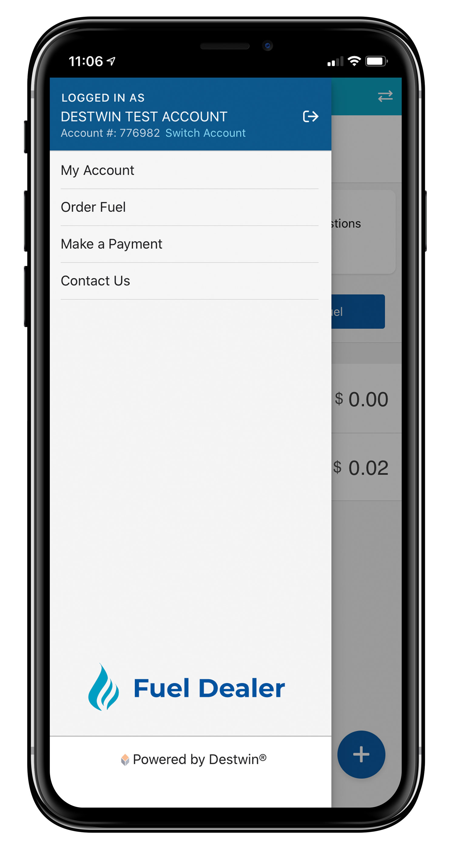
Destwin® Energy Systems is a SaaS B2B company also known as the fuel industry's leading solution for customer portals. Destwin Fuel Dealer Solution™ (FDS) portals provide a customer facing and admin facing interface that draws information from any fuel dealer's back end system and provides functions for their customers to:
Please note, due to company NDA, placeholder logos, information and content have been added for presentation purposes of these projects. Contact me for more details on project contribution and UI/Installation workflow.
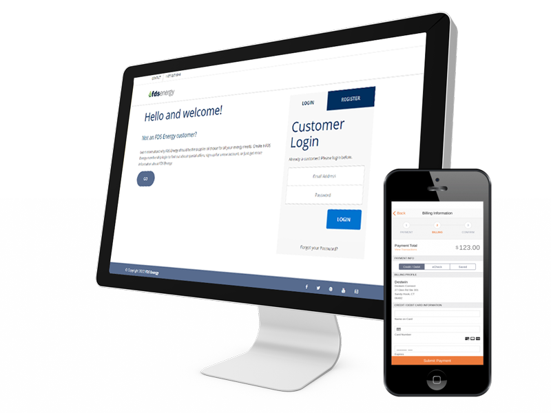
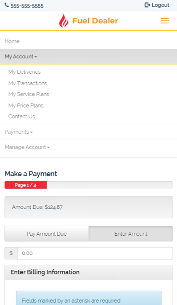
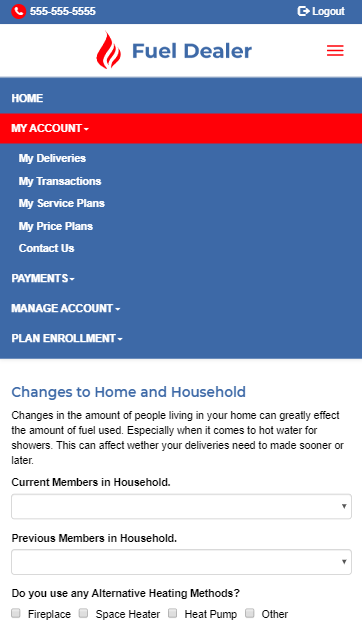
My responsibilities as the Installations Design Coordinator is to customize each portal according to the customer's branding specifications, ensure their portal is fully responsive across all devices and configure functional modules tailored to each customer's needs. The specified configurations include custom menus, form wizards, membership settings, Will Call set-up and other various modules.
For each portal's branding I took into consideration the corporate website's colors and typography. If the site consisted of many colors, I drew from 2-3 that were consistent throughout the site and harmonized with the portal's layout.
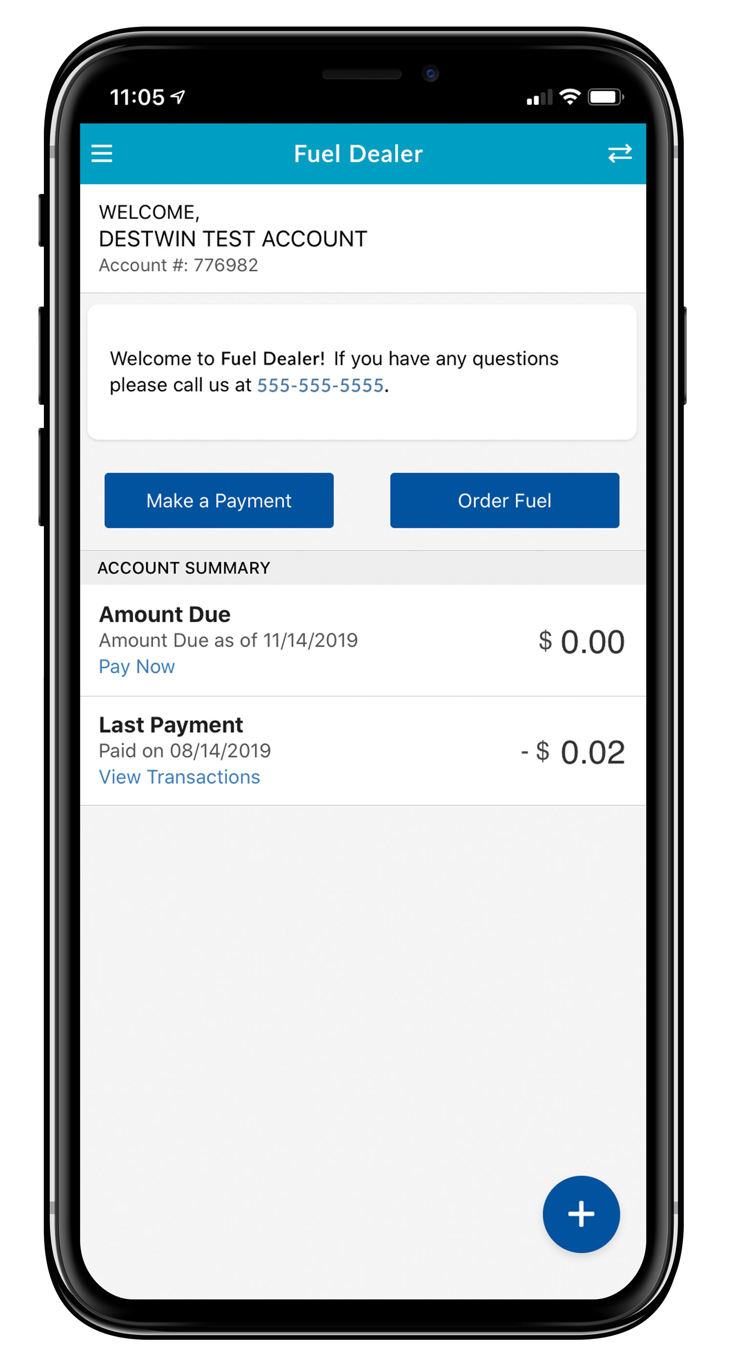
If a customer has also ordered an accompanying app to their portal, I configure the app according to the customer's branding specifications, create app art assets and ensure each module is populating correctly and functioning according to their Destwin® FDS portal.
Other requirements include checking that each app meets the requirements and guidelines of the App Stores for Google and Apple, QA testing for functionalities such as fuel ordering and payment processing through test accounts and pushing the app live to the App Stores. Future version releases are then pushed live when needed.
Installations Design Coordinator: UI Designer, Installations Setup, Product Documentation, QA Tester, Project Manager
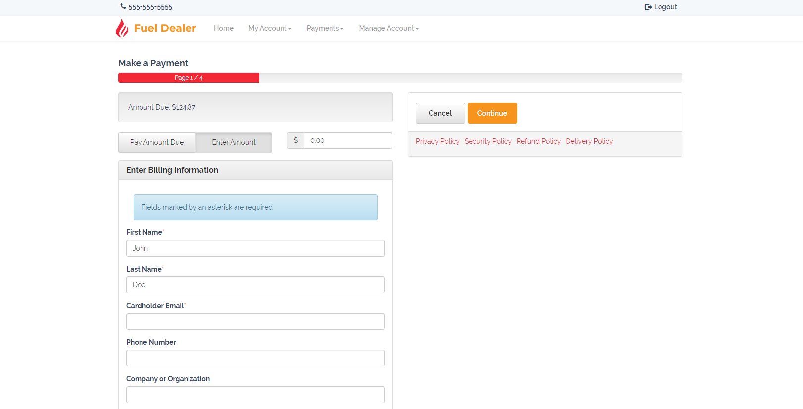
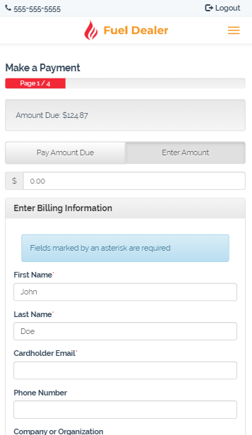
For every portal each standard payment page is configured to ensure the information is easily accessible from Desktops to mobile phones with full width input fields and buttons. Bold colors from the portal's theme are applied to the most important elements in the hierarchy such as the progress bar, privacy links and submit buttons.
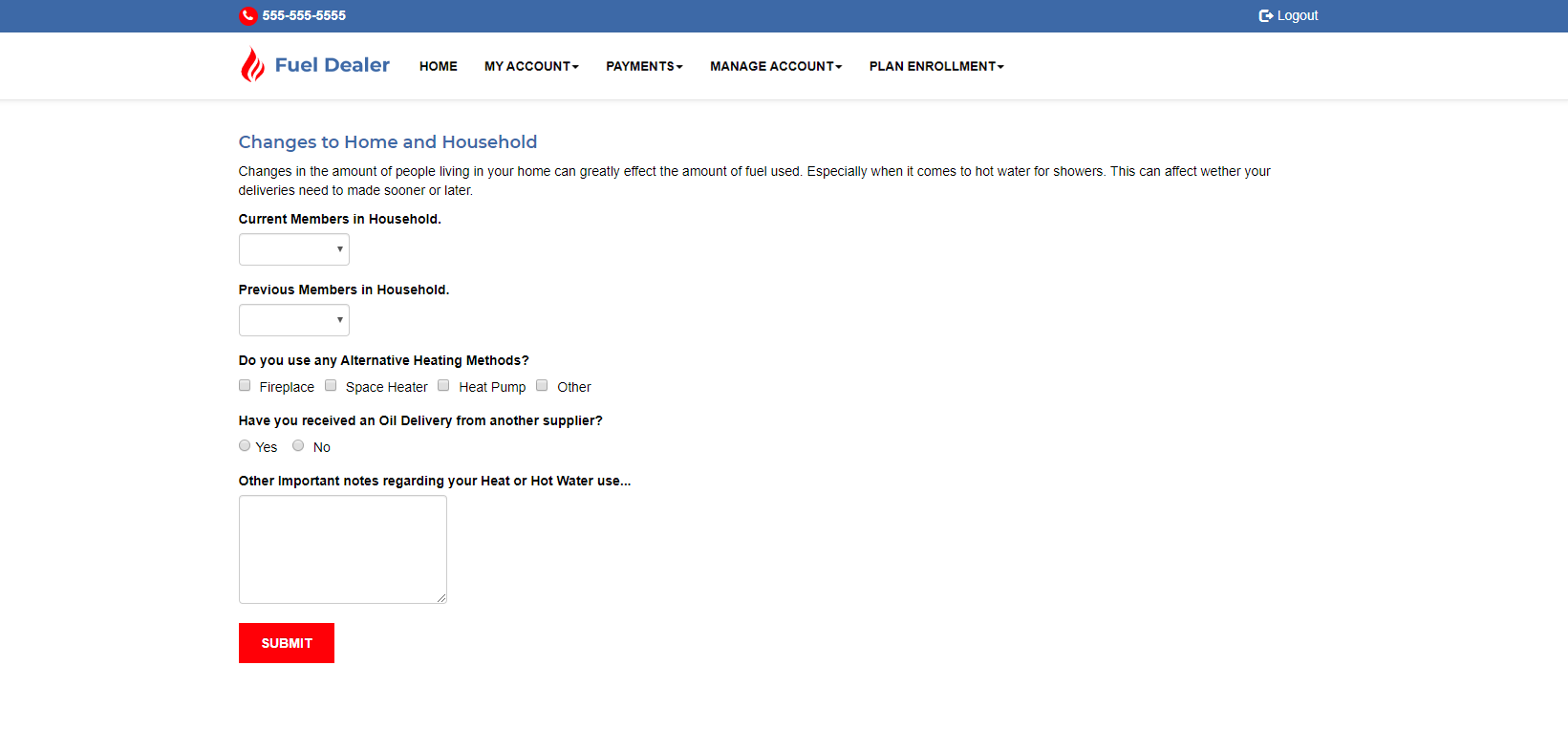
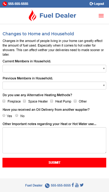
Form Wizards are made for further customization in case the customer wants to either expand on an existing form from the portal or create a new form outside the provided default forms. Once the customer has entered the information for their requested form, the HTML is configured with class attributes and then stylized with CSS to ensure consistent margins and padding. The final step is checking the form for responsiveness across mobile devices and making adjustments if necessary.
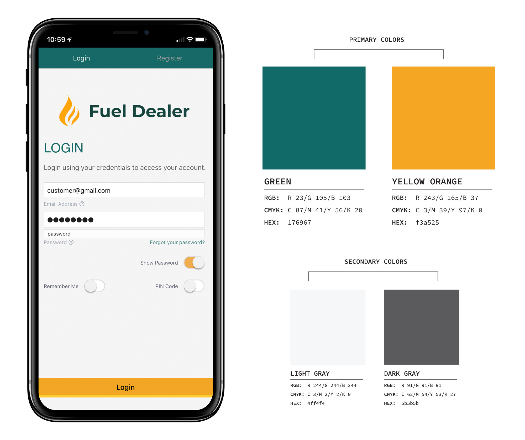
When creating personal branding for each app, I took into consideration the customer's current Destwin® FDS portal and chose 2 primary colors that can be applied to various UI components of the app such as headers, buttons and topbars. It was essential to pick colors that compliment one another to highlight important areas and actions in the app against the neutral gray background, as for example, the active toggle of the login screen and submit buttons. SaaS was utilized for a streamlined template theme file for colors throughout the app.
During the installation process each app needed custom art assets to display customer branding:
Photoshop was utilized creating feature image art with photography and Illustrator to create custom art for the icons as well as convert existing corporate logos to vectorized art and SVG files. Splash screens contained minimal text due to the very brief time the screen shows in the app. Ample amount of padding around the most important information was also added to accommodate various screen sizes. The feature images usually hosted a large photograph to draw attention and showcase the personas of the users of the app, the corporate logo and a brief tagline as with information like the company mission.
Branded app icons were inspired by a customer's corporate logo or imagery throughout their website. It was important to keep the vector illustrations simple and to avoid text as much as possible as icons could be as small as 76px. As the center area is the key focal point in each icon, each illustration emphasized contrast in colors for better readability across different wallpapers.